
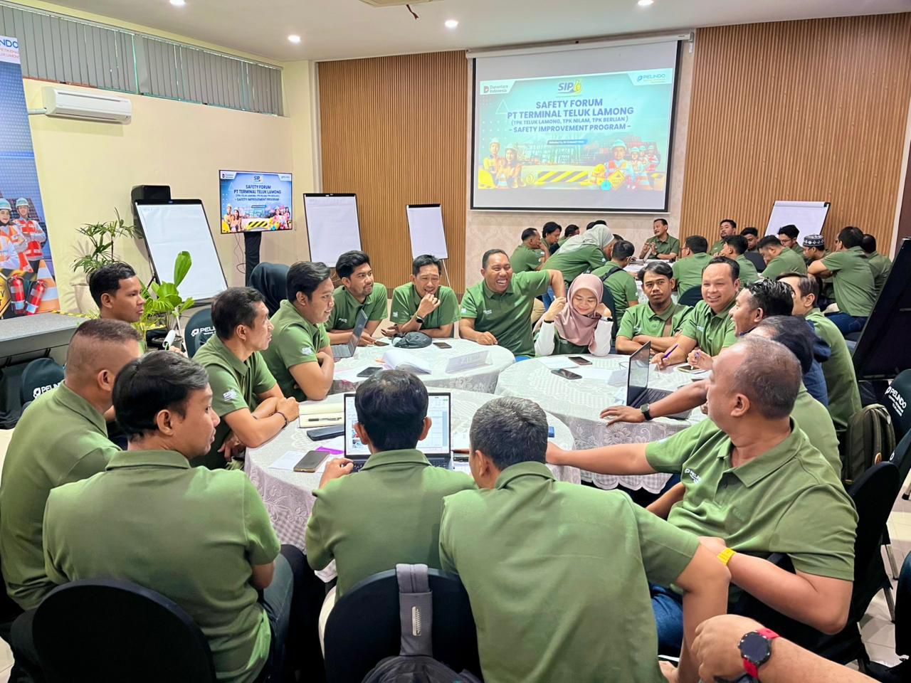
Surabaya, Lintas Surabaya – PT Terminal Teluk Lamong (TTL) menggelar Safety Forum 2026 bertajuk Safety Improvement Program pada 10–12 Maret 2026 sebagai upaya memperkuat implementasi Keselamatan dan Kesehatan Kerja (K3) serta meningkatkan budaya keselamatan operasional di lingkungan terminal.
Kegiatan ini diikuti oleh 65 peserta yang berasal dari TPK Teluk Lamong, TPK Berlian, dan TPK Nilam. Para peserta merupakan pekerja yang memiliki peran strategis dalam pengelolaan keselamatan operasional di area terminal, mulai dari shift manager, operator alat berat, foreman hingga petugas keamanan.
Direktur Utama PT Terminal Teluk Lamong, David P. Sirait, dalam sambutannya menyampaikan bahwa forum ini diharapkan dapat menghasilkan berbagai gagasan dan program konkret untuk memperkuat sistem K3 di lingkungan terminal.
“Melalui forum ini kami berharap lahir berbagai ide, masukan, dan program yang dapat semakin memperkuat implementasi K3 di Terminal Teluk Lamong. Kami juga ingin memastikan seluruh pihak, baik internal maupun eksternal, semakin memahami pentingnya penerapan standar keselamatan di area operasional pelabuhan,” ujar David.
Ia juga menekankan pentingnya konsistensi penerapan reward and punishment dalam implementasi keselamatan kerja, serta perlunya setiap terminal secara berkelanjutan memperkuat program safety induction bagi seluruh pekerja maupun pihak eksternal yang memasuki area operasional.
Safety Forum ini turut dihadiri oleh sejumlah pimpinan di lingkungan Pelindo Group, di antaranya Direktur Manajemen Risiko PT Pelabuhan Indonesia Boy Robyanto yang hadir secara daring, Direktur Utama PT Pelindo Terminal Petikemas M. Adji, serta Direktur Operasi PT Pelindo Terminal Petikemas Muarip, bersama jajaran manajemen Terminal Teluk Lamong.
Dalam kesempatan tersebut, Direktur Operasi PT Pelindo Terminal Petikemas, Muarip, menegaskan bahwa alat berat yang digunakan dalam operasional pelabuhan memiliki potensi risiko yang sangat besar apabila tidak dikelola dengan standar keselamatan yang ketat.
“Peralatan operasional di pelabuhan memiliki tingkat risiko yang tinggi. Oleh karena itu, forum ini diharapkan tidak hanya menjadi ruang berbagi pengalaman, tetapi juga menghasilkan temuan, ide, serta rekomendasi yang dapat diterapkan untuk memperkuat sistem keselamatan kerja di lingkungan Pelindo Group,” ujar Muarip.
Sebagai bagian dari penguatan kapasitas sumber daya manusia, forum ini juga menghadirkan sejumlah narasumber yang membagikan pengalaman serta praktik terbaik dalam pengelolaan K3 di sektor kepelabuhanan.
Melalui sesi sharing session, diskusi kelompok, dan observasi lapangan, para peserta diajak untuk mengidentifikasi berbagai potensi risiko keselamatan yang masih ditemukan di area operasional, termasuk unsafe behavior dan unsafe condition yang berpotensi memicu kecelakaan kerja apabila tidak ditangani secara sistematis.
Pelaksanaan Safety Forum 2026 ini merupakan bagian dari komitmen TTL dalam meningkatkan standar keselamatan operasional pelabuhan, khususnya di tengah kompleksitas operasional terminal peti kemas yang melibatkan aktivitas bongkar muat, pergerakan alat berat, kendaraan operasional, serta interaksi intensif antara manusia dan mesin di area terminal.
Melalui forum ini, perusahaan menargetkan sejumlah capaian strategis, antara lain menurunkan angka kecelakaan kerja menuju zero accident, mengurangi tindakan tidak aman terutama yang melibatkan pengemudi truk di area terminal, serta memperkuat safety leadership pada level supervisor hingga manajerial.
Selain itu, TTL juga mendorong penerapan Behavior Based Safety (BBS) sebagai pendekatan untuk membangun budaya keselamatan kerja yang lebih kuat dan berkelanjutan. Upaya ini diharapkan dapat mendukung pencapaian zero fatality serta menurunkan secara signifikan Total Recordable Incident Rate (TRIR) di lingkungan operasional Terminal Teluk Lamong. (red)





Viajare con mi familia a Tenerife y valoramos una actividad en moto de agua para una tarde libre. Mis hijos adolescentes tienen una confianza distinta en el mar. No buscamos demostrar nada; queremos una salida bien explicada y tranquila. Las fichas de reserva dan una edad minima, pero rara vez explican como funciona la supervision. Para preparar preguntas consulte una referencia sobre rutas de jet ski. Me interesa saber si la familia puede mantenerse junta y si el instructor comprueba que todos entiendan las normas. La explicacion debe ser clara. El instructor ha de ser atento. La distancia entre motos debe ser prudente. El agua deberia estar segura. El chaleco tiene que ser comodo. El grupo debe avanzar a un ritmo agradable. El muelle deberia resultar tranquilo. El horario ha de ser puntual. La espera debe ser comoda. La reserva tiene que quedar detallada. La informacion final deberia ser util. La experiencia debe parecer agradable. El ambiente deberia ser ordenado. ?Conviene reservar por la manana con adolescentes? ?Que pregunta evito una sorpresa en el muelle? Agradezco consejos de otros padres.
I help a community archive prepare old concert recordings for private sharing with former performers. One recording has a lovely room sound and an expressive singer, yet several quiet passages contain small digital chirps that pull attention away from the music. I want to improve listenability without polishing away the atmosphere that makes the recording meaningful. During my research I found this workflow note. It seems relevant, although I would rather hear from people who have restored imperfect live material. My question is how to set a sensible stopping point. The archival ambience is valuable. A careful sample can guide the first decision. I can compare several passages before processing the full file. The restoration should remain subtle. Any change must respect dynamics. I need practical settings for future copies. A controlled listening pass may expose unwanted side effects. The audience reactions should stay intact. The singer’s voice must remain human. Each adjustment should remain safe to document. I will compare it at comfortable volume. I would rather preserve a little imperfection than make the result sterile. How do you decide when a restoration has become too processed? I would appreciate preservation-minded advice.
Earlier this week I quietly cleared the clothes I never wear from my work wardrobe. I have very fair skin, naturally blonde hair, and blue eyes, so I expected the remaining pieces to work together fairly easily. Instead, anything close to warm beige makes me look washed out, especially under the lights in our office. Colours such as dusty lilacs seem calmer, although I cannot tell whether that is a real pattern or simply preference. A recent photo in a slate-blue shirt made the difference noticeable enough that I want a sensible method before replacing the basics. I keep wondering whether I am reacting to my hair colour. To check the suggested ranges, I used cool winter hair colors as a practical checklist. Now I plan to compare the same two tops in office lighting before choosing between navy trousers. I am trying to keep the experiment cheap, repeatable, and practical. Has anyone found one clothing test that stays reliable in different light?
I am editing a remote podcast interview for a local history group. The conversation is clear and worth keeping, but a few transitions contain tiny digital ticks and a light shimmer around some consonants. Because the guest speaks quietly, I do not want aggressive processing to make the voice sound flat or distant. I have been reading about different ways to inspect a recording and came across this workflow note. I am not looking for a one-click promise; I need a sensible review process before I touch the final edit. Would you begin with visual inspection, careful listening, or short comparison exports? The interviewee’s voice needs to stay natural. Each separate repair should be easy to undo. I can work on individual troublesome moments at a time. The dialogue must remain steady. I would prefer gentle adjustments over broad filtering. A controlled comparison export would help with judgment. I also need documented notes for the producer. The room tone should remain natural. The final episode must still sound balanced. Each decision should remain clear to explain. I can review it at comfortable volume. I can accept a trace of noise if the words remain easy to follow. What has worked well when a spoken recording needs restrained repair? I would value examples from editors.
Hola a todos, tengo planeado un viaje a Tenerife y quisiera practicar jetski durante mi estancia. Me puse a investigar sobre los dos lugares mas visitados para esta actividad: Los Gigantes y Playa de las Americas. Por lo que he visto, Los Gigantes tiene unos acantilados imponentes que creo que crearian un marco visual magnifico mientras estas sobre el agua, pero he leido que puede ser un poco mas dificil para alguien con nivel intermedio, especialmente con el oleaje y las corrientes que representan un reto considerable. Por otro lado, Playa de las Americas se presenta como una alternativa mas calmada, ideal para divertirse sin demasiadas preocupaciones, aunque la belleza del lugar no es comparable a la de Los Gigantes. Para alguien que desea un equilibrio entre el paisaje y el disfrute sin riesgos, ?cual recomendarian? He encontrado un post con fotos y analisis que facilitan comparar ambas opciones atlantic moto tenerife , pero me encantaria escuchar experiencias reales de quienes hayan probado jetski en ambos sitios. ?Cual creen que tiene mejor entorno para alguien como yo que busca algo accesible pero con buen paisaje? Les agradezco de antemano sus opiniones.
Me alojare en Puerto de la Cruz y quiero hacer una salida en moto de agua en el sur, pero viajare sin vehiculo de alquiler. Lo complicado es encajar traslado y regreso. No quiero convertir una excursion ligera en un dia de esperas. Para ordenar el itinerario consulte una pagina con ideas para rutas en jet ski. Necesito confirmar que el punto de reunion queda junto a una parada frecuente. Tambien me interesa saber si la empresa ofrece una consigna seca para dejar ropa y telefono. Una zona para cambiarse ordenada facilitaria el plan. Llegaria con margen, aunque agradeceria instrucciones breves. La confirmacion deberia incluir un numero util para avisos. Mi espanol es suficiente, pero una charla de seguridad bien estructurada me ayudaria. Antes de pagar preguntare la duracion total. El regreso deberia permitir una conexion sin carreras. El billete de vuelta tendra un horario amplio. Si hay retrasos por el mar, prefiero una politica razonable. Llevare unicamente lo imprescindible. Tampoco necesito fotos ni extras costosos. ?Alguien ha hecho este plan sin coche? Me servirian consejos sinceros sobre horarios y puntos de encuentro.
Over the weekend I returned to a short Suno demo that had a promising arrangement. On headphones, a thin metallic edge appeared whenever the singer held a note. It was noticeable only now and then, yet once I noticed it I could not ignore it. To begin, I wondered whether it was a monitoring issue. I saved the spot. Before doing anything, I replayed the troubled line from the beginning. I am preparing the draft for two friends, but I do not want to polish away the character that made it interesting. I found fixsuno.top while comparing artifact-removal approaches, and it gave me a useful starting point rather than a promise of a miracle. My first thought was to export again, then compare the same passage at a lower volume. After that I considered a very small repair pass, keeping the untouched file beside it for reference. Has anyone developed a practical listening test for this kind of issue? I am especially curious how you decide whether an odd texture is an export problem before changing anything.
Our community theatre asked me to organize accessories for an upcoming historical play. We have two equally dark scarves, one pinkish and one leaning toward copper. On stage, the rusty shade looks intentional and brings life to the costume. Near the entrance windows, that same scarf creates a strong orange shadow. The cooler option seems dull under lamps, yet balanced when seen in daylight. We need to work with these two pieces and cannot modify their fabric. I kept the camera position and white balance fixed for every comparison shot. The camera records the contrast consistently, although it cannot settle the practical choice. I checked this skin undertone test page for a repeatable comparison method. The comparison method helped isolate temperature from simple lightness or darkness. I am now considering the rose scarf with a slightly warmer stage gel. It should also remain acceptable when the actor enters the brighter foyer sequence. Has anyone working in theatre solved this kind of warm-versus-cool lighting conflict? The goal is consistency on stage, not proving a permanent palette category.
Hola a todos, tengo dos hijos pequenos y estamos planeando unas vacaciones en Tenerife. Me llama mucho la atencion hacer alguna actividad en familia, y he visto que hay rutas guiadas en moto acuatica que parecen emocionantes y distintas. Sin embargo, estoy insegura sobre si estas excursiones son aptas para ninos tan pequenos como los mios, que tienen menos de 6 anos. ?Alguien sabe si las operadoras de estas actividades permiten que monten ninos tan pequenos? Tambien me inquieta el tema de la seguridad: ?que tipo de proteccion y medidas preventivas se ofrecen para los ninos durante el recorrido? He encontrado informacion parcial en la pagina de consultas habituales de una empresa especializada, pero no queda muy claro si hay normas de edad o modificaciones en las motos jet ski цена . Si alguna familia ha participado en esto con sus pequenos, ?podrian contarnos que tal les fue y que recomendaciones tienen? Me gustaria saber si es realmente seguro y si es mas aconsejable otra actividad en el agua para los peques. ?Gracias por cualquier consejo o experiencia que puedan compartir!
I am helping edit dialogue for a student film, and the interviews are clear overall but include occasional clicks at the ends of quiet sentences. We have limited time, so I need a process that is clear to explain to the rest of the team. I do not want a broad filter to make the speakers sound distant. I found this practical guide while looking for a sensible starting point. It encouraged me to test tiny sections before touching a complete scene. I now listen once without looking at the waveform, then check the marked moments visually. The interviewee’s voice needs to stay natural. Each limited repair should remain reversible. I compare separate exports beside the untouched take. The dialogue must stay even. I prefer measured changes to aggressive noise reduction. A short playback helps the team judge the result together. I keep simple notes for later revisions. The room tone should remain soft. The final scene needs to sound human. What sequence would you use when minor defects need attention but speech remains the priority? Practical notes from editors would help.
I received a possible soft cool result and would like to check it in everyday life. I started with existing scarves, tops, and small accessories instead of shopping. The easiest comparisons happen when the rest of the outfit stays neutral. Soft navy, smoky rose, and muted teal feel promising, while icy pastels feel less certain. The question is whether my face looks rested, not whether the item is trendy. An exploratory what is my color palette might suggest questions to test again with fabrics I already understand. I would rather expand useful combinations than police every colour I own. Seeing a colour in both a mirror and a plain photo gives me a better cross-check. Have you found a good way to test a palette gradually with existing pieces? Practical examples with familiar basics would be more useful than a shopping list. The small experiments already feel more useful than a sudden shopping plan. I hope to learn from repeated outfits rather than from a single impressive image. Thanks for sharing what made your palette experiments more realistic.
Before I buy another foundation I want to get a more reliable read on my undertone. The camera on my phone makes everything look different in the kitchen than they do near a window. This time I want to use the same window and a plain neutral wall. I am going to check two neutral fabrics close to my jawline in each photo. Rather than treating one image as proof I plan to look for patterns across several similar photos. For a basic checklist, this skin undertone test camera seems helpful because it separates lighting notes from color observations. Only after the comparison will I test samples along my jawline instead of matching my hand. Please let me know if you have found a better neutral reference for this kind of home test? I know a camera cannot replace seeing real skin in changing light, and I am not expecting a perfect answer from one home experiment. My goal is simply to make the next store visit less confusing. Keeping a short record of conditions should also help me recognize when a surprising result is probably caused by lighting rather than my actual coloring.
Viajare en tren para una escapada rural y estoy valorando dormir en un alojamiento burbuja, pero no llevare coche. La idea me gusta porque quiero desconectar una noche, aunque necesito calcular muy bien los ultimos kilometros y la hora de llegada. Algunas propiedades parecen preciosas, pero no explican si hay taxis fiables o recogida cercana. Para comparar opciones abri esta guia de alojamientos burbuja. Me ayudaria conocer experiencias de personas que llegaron sin vehiculo propio. La estacion debe quedar a una distancia razonable. El traslado tendria que ser reservable. La ruta final debe estar indicada. La llegada necesita un horario realista. El anfitrion deberia responder de forma amable. El equipaje debe poder llevarse con ayuda. La parcela tendria que sentirse privada. La noche debe resultar relajada. El desayuno deberia ajustarse a un horario practico. La salida tiene que ser comoda. El regreso a la estacion deberia estar confirmado. La informacion local debe ser breve. El conjunto tiene que inspirar una sensacion comoda. ?Que margen de tiempo dejaron para llegar y volver al tren? Gracias por compartir horarios reales.
Buscamos una pausa corta para pasar tiempo juntos sin planes complicados. Granada nos parece una zona practica porque podemos llegar sin demasiada carretera. Las fotos son bonitas, pero queremos entender los detalles cotidianos antes de elegir. Antes de escribir a varios sitios lei una guia de hotel burbuja granada y me ayudo a preparar una lista sencilla de preguntas. Queremos saber si explican bien el aislamiento y la temperatura nocturna. Miraremos como es la llegada si anochece antes de registrarnos. Preferimos una parcela tranquila a una lista larga de actividades organizadas. Valoramos mas el orden y la higiene que una promocion demasiado perfecta. Un extra exterior esta bien, aunque primero miraremos comodidad y privacidad. Despues compararemos solo dos o tres lugares usando las mismas preguntas. Agradeceria consejos de personas que hayan ido fuera de temporada. La intencion es disfrutar del paisaje, cenar tranquilos y volver descansados al dia siguiente.
I finally took an afternoon looking through the deeper shades I already own. Initially I felt that Deep Winter explained every color I liked. On some days charcoal looks polished while very black tops sometimes make my face look tired. I began comparing navy, espresso, cool gray, and muted plum near my face. The comparison made me realize that one palette name may be too simple. I found this color analysis as a way to compare details without chasing a quick label. Now I am leaning toward colors that feel deep but do not overpower my features. Has anyone else compared palette labels before replacing a whole closet? I am deliberately leaving bright lipstick, dramatic jewelry, and online quizzes out of this first comparison. Those may be useful later, but right now I only need a repeatable view of familiar clothing in ordinary daylight. A few careful notes feel more useful than a dramatic makeover or a rushed decision about every future purchase.
I have narrowed my notes to Deep Summer and Soft Winter for now. Online palettes seem simple, yet real fabrics make them blur together. My notes began with photos taken in one steady, shaded spot. I also left out makeup, jewellery, and patterned clothing for the test. The darkest drapes felt dramatic, yet not every one looked relaxed in daylight. Muted cool shades appeared balanced, but I want more than a personal hunch. Rather than naming a season first, I noted contrast, texture, and eye clarity. A simple color analysis might help me test the same questions again under consistent conditions. I do not expect a quiz to replace a trained consultation or good lighting. What has helped you distinguish a deep cool palette from a softer cool one? I would especially value methods that still work on an overcast day. I am trying to keep the exercise practical instead of treating one answer as absolute. Repeated observations across ordinary days should be more useful than one flattering photograph. Thanks in advance for examples of what you found genuinely repeatable.
I am planning a capsule wardrobe and want to confirm my season before choosing the main colors. A few simple assessments indicate autumn although the exact subtype changes. Camel and olive work well but mustard and strong rust can make my complexion look uneven. Because the plan uses only a few pieces each neutral and accent needs to combine easily with the others. autumn seasonal palette gives me a starting list to compare but I would like to validate the direction with actual fabric. My first idea is to compare cream, warm navy, chocolate, olive, muted teal, and brick. I plan to document every drape in indirect daylight using the same camera settings. When choosing everyday neutrals should I focus more on skin clarity or on harmony with my hair and eyes? I need two useful accent shades that can work across casual and slightly formal outfits. A subdued turquoise may work while brick red may be easier than orange. Would this be enough to verify autumn or should I add a cooler control color for comparison? A compact sequence of comparisons would help me avoid buying colors based only on a label. My focus is a wearable result rather than following every suggested autumn shade. Please share any useful comparisons
Our small podcast team is reviewing music beds for an episode, and one generated cue has an unusual texture under a spoken transition. No one is certain yet because the voice, music, and room noise make the moment hard to isolate. Our first step is to record the timestamp and ask the editor to hear it in the full sequence before making a decision. A brief comparison excerpt could make the discussion clearer without asking anyone to diagnose the entire track. It helps to distinguish an editing preference from a sound that interferes with the spoken content. It gives the editor a focused question. I came across an overview of ai audio artifact removal while looking for neutral language for that handoff. The editor can judge whether limited attention is useful with the original cue available for comparison. It keeps the review focused and avoids presenting a technical suspicion as a settled result. I would appreciate examples of a concise review note.
Queremos organizar una noche tranquila para celebrar una fecha especial. Granada nos parece una zona practica porque podemos llegar sin demasiada carretera. Las fotos son bonitas, pero queremos entender los detalles cotidianos antes de elegir. Buscando criterios concretos termine revisando hotel burbuja granada y me ayudo a preparar una lista sencilla de preguntas. Nos interesa confirmar que el descanso no dependa solo de una noche templada. Miraremos como es la llegada si anochece antes de registrarnos. Nos fijaremos en la separacion entre las unidades y las zonas comunes. La limpieza y una descripcion honesta del bano son mas importantes que un adorno llamativo. Un extra exterior esta bien, aunque primero miraremos comodidad y privacidad. Despues compararemos solo dos o tres lugares usando las mismas preguntas. Me vendrian bien experiencias sinceras de parejas que hayan pasado una noche alli. Con una preparacion razonable, esperamos una noche sencilla y agradable sin idealizarla.
Estamos valorando una escapada corta por Alicante fuera de temporada alta y nos gustaria que fuera comoda, sin gastar de mas ni llegar con expectativas poco realistas. La idea del jacuzzi nos atrae despues de un paseo, pero queremos entender bien si es privado, como se reserva y que condiciones tiene segun el tiempo. Nos parece razonable comprobar que servicios estan incluidos y si existen suplementos que no aparecen claros en el primer anuncio. hotel burbuja alicante con jacuzzi En varias paginas la informacion es atractiva pero preferimos conocer detalles sobre limpieza, horario de entrada, calefaccion y distancia a restaurantes o tiendas. Antes de elegir una fecha nos ayuda que los servicios y sus horarios esten explicados sin ambiguedades. Queremos prevenir situaciones donde el entorno sea ruidoso o el uso de las instalaciones tenga limitaciones inesperadas. Una respuesta transparente nos permitiria reservar con tranquilidad y sin sorpresas despues. No buscamos una promesa espectacular. Nos conformamos con comodidad, informacion honesta y tiempo para descansar juntos. Si alguien ha comparado precios ?que pregunta conviene hacer antes de confirmar la reserva?
Estoy pensando en hacer una escapada de una noche cerca de Barcelona por mi cuenta y me atrae la idea de dormir en una burbuja, aunque quiero plantearlo con bastante sentido practico. Al ir sin compania me fijo en la privacidad real, la iluminacion del camino y la facilidad para contactar con el alojamiento si surge una duda. No quiero encontrarme con un sitio donde las parcelas esten demasiado juntas o donde la descripcion deje preguntas basicas sin responder. hotel burbuja barcelona Cuando leo opiniones me fijo mas en detalles como ruido, limpieza, acceso nocturno y trato del personal que en fotografias muy retocadas. Cuando comparo la informacion me sirve que la descripcion explique con claridad la distribucion del espacio. Quisiera saber si hay normas claras sobre llegadas tardias, desayuno y uso de las zonas comunes. Una explicacion transparente vale mas para mi que una promesa demasiado perfecta. No necesito una experiencia de pelicula. Para mi bastan tranquilidad, buena organizacion y un espacio donde descansar sin incomodidad. Si alguien ha comparado varias opciones ?que senales os sirvieron para saber que el lugar era adecuado?
I am revisiting my seasonal analysis because olive skin can produce contradictory results. My hair is very dark and my eyes are medium brown, so the overall contrast can look winter-like. Yet in some lighting my skin has a green-gold cast that automated tools often interpret as warm. Vivid orange dominates my face while cool berry and deep teal are usually easier to wear. These color tests prompt me to consider whether I belong in a cool winter range or a softer neighboring season. olive skin tone seasonal palette seems relevant to this question but I do not want to force the result to match one chart. When testing in daylight would you compare pure white with cream before testing accent colors? Both common metals seem acceptable so I need clues that work better for olive skin. I can photograph the same drapes and review whether shadows, redness, or eye definition change. Which winter colors would you test first without relying on stereotypes about skin depth? Advice from people with this undertone would be especially useful. I care more about repeatable tests than matching every traditional description perfectly. Any careful guidance is welcome
I’m trying to make a small wardrobe easier to combine, and I keep coming back to autumn colors. I don’t want to buy a whole palette based on a quiz result. I often reach for softer warm colors instead of sharp bright ones. That impression could be about personal taste rather than what suits my face, so I want to check it more carefully. I could start with two neutral tops and one accent color. Olive, camel, and rust are easy to find secondhand near me. I can compare them in natural light before spending money, ideally with the colors next to my face rather than laid out on a screen. I also want to see how each shade works with the clothes I actually wear. While researching what is my color palette I found several labels, but I would prefer a small real-world test over memorizing every category. Is it easier to test a warm neutral first or a stronger color? I can keep notes on how the colors look at different times of day. The goal is a handful of pieces I will use repeatedly. I hope the trial gives me useful choices even if the label stays uncertain. How would you test an autumn direction with just a few borrowed garments, and what would make you reconsider it?
I am choosing a new profile photo and noticed that my face looks noticeably different across pictures taken on the same day. In a close camera shot it looks wider, while a portrait taken from farther away gives me another impression entirely. I understand that head position matters, but I would like to compare the pictures without overinterpreting one frame. I had initially been reading about skin tone analysis and that reminded me how much camera conditions can affect appearance judgments. I am now trying to look at face proportions as a separate issue. I could start with several evenly lit photos and note whether the forehead, cheekbones and jaw look consistent across them. Checking the overall outline could make the comparison easier, but I do not expect one result to settle which photo is best. Have you found that stepping back makes these comparisons more reliable? I would also like to know whether a relaxed expression is better than a posed smile when checking the outline. I mainly want to avoid judging one distorted selfie before picking a picture to use.
I’m trying to work out whether Deep Summer or Deep Winter is closer to my coloring. Dark navy usually feels comfortable on me. That observation isn’t enough to settle it, because my photos change a lot between daylight and warm indoor light. I often feel that bright white draws attention away from my face. Muted berry and charcoal seem promising, but I can’t tell whether that’s because of their depth or their softness. I’m hoping to test this with pieces from my closet first. I came across a page about deep summer color palette while collecting examples for a side-by-side check. Would you begin with softer blue next to a clearer blue? I’m looking for a test I can repeat in the same light, not a diagnosis from one selfie. If you’ve faced the same choice, which pair of colors made the difference obvious? I can avoid changing the camera angle between pictures. Then the comparison should be less distracting. I can ask a friend to look at the same set of photos so I don’t rely entirely on my own impression. A few concrete color pairs would help me start.
I want to plan a compact wardrobe instead of buying isolated colors and would like the palette to be practical rather than exhaustive. Muted olive, terracotta, and soft cream usually work well while optic white and cool gray make me look tired. That suggests an Autumn direction although very orange camel and yellow mustard are not convincing. I used an online what is my color palette as a starting point, but I want to verify it with clothes I already own. Ideally I need a pair of neutrals, three accents, and one pale shade that can all be worn together across seasons. Dark brown is easier than black but I am unsure whether navy could still function as a second neutral. For accents I am considering teal, brick red, and forest green rather than buying several nearly identical earth tones. How would you test whether these colors share enough warmth and softness under both daylight and ordinary office lighting? I would value examples from anyone who keeps a genuinely small wardrobe, especially any unexpected neutral that increased the number of combinations.
I am in a small theatre production next month, and the costume designer suggested face-framing bangs for my character. That sounds lovely in a still photo, but I have to pin my hair up between scenes, sometimes in less than two minutes. Several scenes involve quick turns and movement. A fringe that falls into my eyes would be distracting, particularly with bright lights facing the audience. I need to see my marks clearly through each scene. I have fine hair that rarely holds a strong curl, so I cannot count on a styled bend staying in place for the whole performance. I found curtain bang lengths helpful for naming the options, but I need to decide where the shortest pieces should actually end. Would cheekbone-length pieces still tuck behind an ear? I can rehearse with clips before cutting anything, although the final costume headpiece may change how the hair sits. A rehearsal should show whether the clips stay secure. I need something I can wear comfortably outside the production. A workable backstage routine matters more to me than a perfect publicity photo. Has anyone dealt with bangs during quick costume changes? What length gave you a useful frame without blocking your view?
I have an upcoming video consultation with a hair-color client because the client cannot visit the salon until the day we perform an in-person strand test. I need notes that remain useful when we later compare real swatches. My concern is that her phone camera looks warm while the reference photographs she sent were taken under several kinds of indoor lighting. I am avoiding firm conclusions from compressed video, but I would like the conversation to narrow down sensible shade families before the appointment. I plan to share this online color analysis to organize observations that we can verify later in person. Would it help to ask for one daylight photo beside a gray card, and is it worth comparing the same image on two devices during the call? I can also ask about previous dyes, fading, and maintenance limits. How would you keep this efficient while leaving the final choice for the salon?
I need new glasses and am deciding between warm tortoiseshell and dark blue frames. A seasonal quiz gave me an Autumn result, but I am unsure which frame looks better beside my face. The shop lighting is warm, and both options look different outside. As I use glasses all day, I want a choice that feels comfortable with ordinary clothes as well as with my skin tone. I have tried each frame with a cream top and a cool gray top, but that also changes the background against which I judge them. I am thinking of trying to take a short video in indirect daylight while keeping the camera exposure fixed. I could also ask a friend to look at the frames in person, since a phone image may exaggerate the warmth of the store lights. While looking up palette terms, I found a page about what is my color palette as a starting point, but I would like a method that works for this purchase, even if my season label remains uncertain. Would you judge the frame against bare skin first, or would you focus on how they balance the color of the eyebrows and eyes? I can make another trip when the light is better. I want to compare them properly. I would appreciate firsthand advice. A side-by-side picture may help later.
I am trying to make my wardrobe smaller, and I would rather understand which colors I actually wear well before buying anything new. I laid out several pieces I wear regularly. The same blue looks calm next to my face by a window, but oddly harsh under the warm bulbs in my room. That difference is enough to make me hesitate. I have been reading about personal color analysis as a way to give these comparisons some structure. I would hold each sample at the same distance. I have a quiet morning when I can test this properly. I would place a few fabrics near my face, keep the background neutral, and take notes instead of trusting a single photo. Would you compare light and dark versions first? I could record the clearest differences in a notebook. I am also unsure whether to include makeup, since it might change the result I am trying to observe. A simple repeatable sequence would help me. If you have tested colors this way, what did you look for in your face and eyes, and which differences were too subtle to trust? I would rather learn from my existing clothes first. Any practical order for the comparisons would be appreciated.
I have been trying to understand my undertone before buying a few replacement basics. The confusing part is that my face looks different in every photo. In indirect daylight, a muted blue top seems comfortable next to my skin, but under the warm bulbs in my bedroom the same top looks flat. I also tried holding cream and bright white fabric near my face, and that comparison changed when the phone adjusted its exposure. I would like to make this a repeatable test rather than decide from a single flattering photo. I found a page about skin undertone test camera while looking for a place to organize the questions, but I would still value real observations from people who have done the fabric comparisons themselves. Should I start with plain fabrics in cool and warm pairs before looking at full seasonal palettes? I could keep the same daylight spot and turn off the room lights each time. I keep going back and forth on whether shadows under the eyes are a useful clue or just a result of the angle. A neutral background could make comparisons easier. If you have a simple routine, which two or three checks gave you the clearest answer? I would rather use what I own first before spending money on a new palette.
I have an interview next week and already own the jacket and trousers I plan to wear. What I still need to settle is the shirt and a small scarf near my face. The quiet colors seem fine in person but look washed out on camera; the brighter scarf is more interesting, yet I worry it will draw too much attention. I started looking at personal color analysis to give myself a better vocabulary for comparing the options. I am not trying to rebuild my wardrobe for this one occasion. If I compare the outfits in indirect daylight, should I focus on whether the face looks clearer, or whether the colors feel appropriately subdued? I can lay the accessories against the jacket before deciding. I know the camera may exaggerate a strong shade. If you have balanced color and formality before, what would be the most useful comparison to make before I pick one?
I am arranging informal family portraits at home, and I want everyone to look like themselves rather than wear matching outfits. The room has one large window and a plain wall we can use as a backdrop. My first thought was a bright blue sheet. It may draw the eye away from the people. A neutral cloth might be calmer, although beige seems to wash out one person’s pale shirt. Skin tones vary across the group and nobody wants to purchase an outfit just for one afternoon. I have been reading about color analysis as one way to think about contrast, while keeping the actual clothing choices flexible. Would you test the backdrop first with each person standing in the same patch of window light? I could take a few unedited phone pictures and compare them side by side before we commit to the setup. I would appreciate an easy check for balancing clothing colors with the background without making the group look artificially coordinated. How do you keep the faces prominent in a mixed group? We can change the backdrop if needed and I am open to testing rather than guessing.
I am packing for a three day work trip and trying to make one small bag cover several meetings. I already have navy trousers and a grey jacket, plus comfortable shoes for the walks between our meeting locations. I keep getting stuck on tops because I want some variety while still using the same trousers and jacket. For a starting point, I have been exploring color analysis yet my priority is checking existing combinations instead of replacing my wardrobe to match a seasonal label. Would you choose one lighter top and one deeper shade, or keep all the tops close in tone? There is also an informal dinner, and I would like to use the same jacket without looking dressed for another meeting. If you were working with these pieces and limited luggage space, which two outfit decisions would you settle first?
I am looking for a secondhand jacket to wear through autumn, and narrowing the listings has been harder than expected. Fit seems manageable with careful measurements; color is less clear when every seller photographs the jacket in a different room. Because returns are not always available, I want to reduce uncertainty before spending time on a visit or paying for delivery. Most of my trousers are charcoal or denim, and I would like the jacket to work with both without much planning. I found a page about color analysis and would like to use the idea as a starting point for these comparisons. A well-styled listing can make almost any shade tempting, but I want to judge its usefulness with my own clothes. Could a seller photograph taken near a window make the color easier to assess, provided a white item is visible? Seeing the jacket locally would let me compare it with a top I already wear, instead of relying entirely on photographs. What would you check first when choosing among similar used jackets, assuming the condition and measurements are already acceptable?
Пытаюсь состыковать самолёт и поезд через Сочи, но пока не решаюсь покупать билеты с короткой пересадкой. Со мной будет багаж, поэтому вариант с быстрой пробежкой между транспортом и платформой сразу исключаю. В обсуждениях встречается слово вокзал без уточнения, и из-за этого трудно понять, про какую именно точку говорят. При поиске схемы пересадки нашёл тему сочи аэропорт и жд вокзал расстояние — это отправная точка для дальнейших уточнений. Ещё хочу заранее сохранить схему переходов в телефоне, чтобы не искать её после прилёта. Если потребуется пересадка по пути, важно понимать, где покупать следующий билет и как ориентироваться с чемоданом. При этом одной цифры недостаточно, ведь после посадки ещё предстоит получить вещи и найти место отправления. Подскажите, какой запас вы обычно оставляете, если оба билета куплены отдельно и следующий поезд пропускать нельзя. Точные расписания проверю перед покупкой, сейчас хочу понять порядок действий и возможные места, где теряется время. Буду благодарен, если в ответе укажете конкретную станцию и поясните, ехали ли вы с багажом или налегке.
Планируем неделю на Канарах зимой, но с выбором острова ещё не определились. Пляж приятен, однако проводить весь отпуск только у воды нам не хочется. Возможно, обойдёмся без машины, если удастся подобрать удобное место проживания. Стараемся избежать плана, где переезды занимают больше времени, чем сами остановки. Интересуют небольшие населённые пункты, доступные тропы и места для спокойного обеда. При выборе базы стараюсь разобраться, какие погодные различия действительно влияют на планы. Для пасмурного дня нужен простой запасной план, который не зависит от длинной дороги. Интересны советы тех, кто выбирал одну базу и не пытался объехать всё сразу. канарские острова — собираю здесь идеи для обсуждения. Не воспринимаю общий список как готовый маршрут: сначала выберем базу, затем проверим транспорт и оставим несколько дней без обязательной программы. Ещё интересует обычный бытовой вопрос: удобно ли рядом покупать продукты и ужинать вечером, если автобусные поездки занимают значительную часть светлого времени суток.
На этот раз выбираю побережье с более прохладной погодой и рассматриваю север Испании. Думаю о поездке, в которой можно чередовать прогулки у моря, небольшие города и спокойные дни без плотной программы. Купание хотелось бы оставить приятной возможностью, а не обязательным ежедневным пунктом. Главный вопрос сейчас — просторный берег или небольшая закрытая бухта. На фотографиях оба варианта выглядят привлекательно, а вот ощущения при ветре и пасмурной погоде представить сложнее. Для выбора района сначала изучаю соседние населённые пункты. В частности, рассматриваю города на севере испании и ищу рядом прогулочные маршруты на день без пляжа. Слишком много переездов в этот отпуск включать не хочу. Скорее проведу больше времени в одном месте, чем буду спешить дальше. Отдельно рассматриваю доступность магазинов и кафе, чтобы в дождливый день не зависеть от длительной поездки в другой город. Какой компромисс между пляжем и прогулками вам кажется удачным? Особенно полезны детали о береговых прогулках, ветре и повседневном удобстве выбранного места.
Собираю короткую поездку в Вену для нескольких коллег. Днём у каждого свои дела, а на вечер хочется предложить одну общую прогулку. Пока обсуждаем только подход к выбору места, без покупки билетов и бронирования. Одни хотят спокойно поговорить за горячим напитком. Другим интереснее посмотреть украшения и пройтись между прилавками. При поиске попался запрос рождественские ярмарки в вене 2025 — оставил ссылку в заметках к предварительной программе. Понимаю, что прошлогодние материалы не подтверждают даты и условия следующей поездки. Поэтому хочу отдельно выписать вопросы, которые проверим ближе к выезду. Первым делом проверим время работы и порядок входа. Дальше посмотрим, удобно ли добираться от места встречи. Также договоримся о запасном плане при плохой погоде. У нас будет общая точка сбора и ограниченное время, поэтому полезнее заранее согласовать ожидания каждого, чем пытаться за один вечер охватить все найденные места. Какие сведения вы обычно перепроверяете у организаторов, даже если описание выглядит подробным? Помогите составить короткий список для такой проверки.
Готовимся к поездке в Прагу, и дочь хочет заранее понять, кому посвящены памятники на городских площадях. Пытаюсь подготовить несколько понятных историй для прогулки, а не превращать отпуск в школьный урок с проверкой знаний. Для начала смотрю материалы по запросу Ян Гус. Меня смущает объём материала: некоторые подробности требуют отдельных объяснений, и основной сюжет легко теряется среди новых терминов. Обычно ребёнок лучше слушает, если понятно, чего человек добивался, с кем спорил и почему его помнят спустя столетия. Хотелось бы обозначить, где речь идёт об известных событиях, а где начинается популярное объяснение, упрощающее сложную историческую картину. Если вы уже обсуждали эту тему с детьми, подскажите, с какого вопроса начали и что вызвало больше всего интереса. Если знаете понятный текст для первого знакомства, поделитесь названием и объясните, для какого возраста он вам показался подходящим. Планируем обсуждать это без спешки.